1. The Emotion of Geometry
Circles, triangles, curves, lines — these forms exist beyond language it is called Minimalist Graphic Design Emotion. They belong to childhood drawings, ancient symbols, road signs, and constellations. They’re instantly recognizable, yet endlessly open to interpretation.
-
A triangle can be a mountain, a warning, a direction.
-
A circle can be a sun, a hole, a face, a moment.
-
A line can divide or connect.
What makes them emotional is not just their shape, but their relationship to space, to color, to context. When used intentionally, they become almost musical — visual chords that hit us where logic doesn’t reach.
2. Minimalism as Presence, Not Lack
In the design of Tamalpais sneakers, we strip down to what’s essential — not because we reject complexity, but because we want to highlight it more clearly.
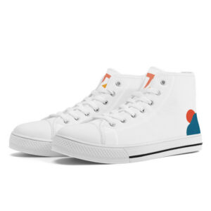
Take the Sunrise sneaker:
-
A white canvas like morning light,
-
A curve of ocean blue,
-
A perfect orange circle: the sun.
It’s not an illustration. It’s a suggestion. And that’s what gives it power. You don’t need to “understand” it to feel something — your brain fills the rest, and your body responds.
In a fast world, simplicity becomes intimacy.
3. Visual Calm, Emotional Depth
Our graphic choices are not about trends. They come from a deeper place — the need for visual calm.
When you walk with Tamalpais, your sneaker is not shouting for attention. It’s part of a quiet conversation between you and your environment.
This calmness is powerful:
-
It grounds your outfit.
-
It reflects your mood.
-
It allows space for interpretation.
In a way, it’s like poetry. You read between the lines.
4. Color as Emotion
In minimalist design, color becomes the emotion.
We use only a few tones per model — always derived from nature or art:
-
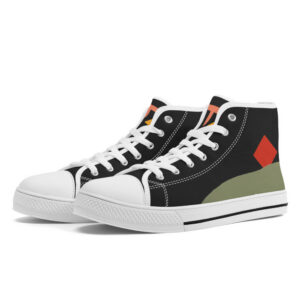
The deep green of Zénith evokes forests or hills,
-
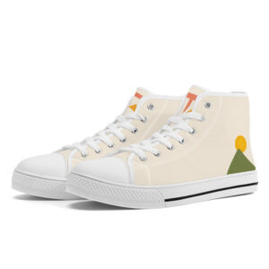
The sunroot yellow on Pyramids brings warmth,
-
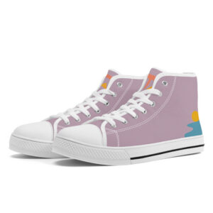
The lavender blue of Watercourse flows like twilight.
There is no excess. And that’s why each color carries so much weight.
We dye with plant-based pigments, not just for sustainability, but because it feels right — a material echo of our respect for slowness and life.
5. Identity Through Simplicity
Our logo is a story in two strokes: a brush-painted “T”, and a triangle peak. Nothing more.
But it contains everything:
-
A reference to Mount Tamalpais,
-
A link to painting and handwriting,
-
A symbol of movement and elevation.
Placed on our shoes, caps, totes, or brushes, it becomes a mark of quiet identity. Not a brand shouting to be seen, but a gesture — something you recognize when you’re ready.
Conclusion: Feeling in the Form
At Tamalpais, we design with one question in mind:
Can a single shape make someone feel something?
And the answer, we believe, is yes.
Because when you slow down — really slow down — you begin to notice how a circle leans, how a line breathes, how a triangle points not just upward, but inward.
Minimalist graphic design is not about doing less.
It’s about doing exactly what’s needed.
No more. No less. Just meaning.
And in that space, emotion unfolds.
-

Watercourse
145,00 €Rated 4.00 out of 5 -

Sunrise
145,00 €Rated 3.00 out of 5Select options This product has multiple variants. The options may be chosen on the product page -

Etel
145,00 €Rated 5.00 out of 5Select options This product has multiple variants. The options may be chosen on the product page -

Zénith
145,00 €Select options This product has multiple variants. The options may be chosen on the product page
